Digistock – Imperfect Kodachrome for Capture One
Digistock – Imperfect Kodachrome for Capture One
Kodachrome Capture One Styles Pack
A legend comes to Capture One! One of most iconic films ever made, recreated lovingly as a C1 style pack. It’s impossible to get a perfect emulation of a stock that’s no longer possible to even develop, of course, but this pack is full of character and mojo. Created by Digistock. View all Digistock/Kyle May Capture One Styles →
There’s a reason Kodachrome doesn’t show up often in preset makers’ portfolios – it’s really, really hard to get right. The fact it’s no longer possible to process it means a lot of the usual methods for making film styles simply can’t be done, it’s more of an art than a science. There’s not really been any accurate emulation that I’ve come across (though I hope this pack is a step in the right direction), but the real deal was developed for the last time in 2013, and it’s highly likely that’s all we’ll ever get.
Why call this pack ‘Imperfect’? Because I don’t think it’s possible to accurately emulate a film stock that spanned so many decades, used several different emulsions and processes, and is no longer available. We’ve done our very best to capture the look and feel of these iconic transparency films throughout the decades, however, and hope you find these styles useful and versatile.
STYLES
To keep things simple we’ve put the main presets in two folders – Clean and Grain. Exactly the same presets in both, the only difference is the grain versions have simulated film grain and softness, and the clean ones – unsurprisingly – don’t.
K25 – Kodachrome II/25
Released in 1961 as Kodachrome II, and in the mid-70s changed to Kodachrome 25 using the new K-14 process with new dyes and better sharpness, but I’ve bundled the two together here since they share a similar look. Rich timeless colours, incredible detail, plenty of contrast – it’s an all-purpose film (though it shines most of all for outdoor scenes).
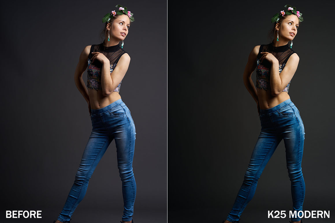
1A) K25 – Modern A fairly subtle shift in colour and contrast, reminiscent of a scanned slide from the last two decades. Warm, rich reds and a slight shift in the greens, with a subtle lift in the blacks.
1B) K25 – Clear A good everyday preset, with deep shadows and a neutral tonality. Foliage and other greens shift a little towards cyan.
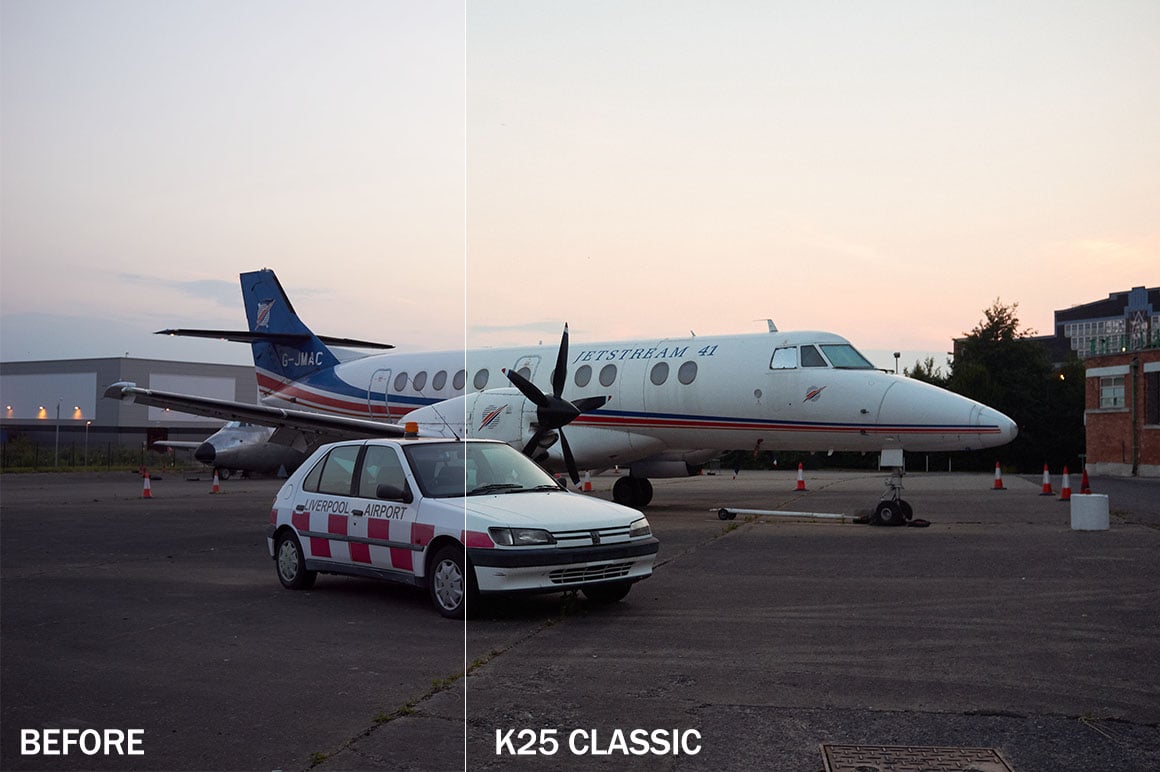
1C) K25 – Classic More of a vintage look, like a typical 1970s/80s slide. A little less contrast and saturation with skintones taking on a slightly orange hue.
1D) K25 – Cool Inspired by slightly faded 60s slides, a desaturated, almost matte palette. Greens take on a cool cyan hue, and red-orange shifts towards rusty tones. Can create some strange skintones on certain images, but great on others.
1E) K25 – Rich Bright, punchy and saturated. Based on old landscape shots my grandad took on K25 in the 1960s.
1F) K25 – Vintage A green-blue cast and lifted blacks help recreate the look of an old slide, perhaps one that’s not been stored well.
1G) K25 – Faded Slide Not based on any particular slide I’ve seen, just a generally aged variant. great for fashion etc, or added as a layer and blended.
K64 – Kodachrome-X/64
The younger, faster brother. Originally released as Kodachrome-X with a faster ASA64 speed, and updated in the 1970s as Kodachrome 64 with the new K-14 process. Often unfairly represented as having a magenta/pink cast, perhaps due to its unforgiving nature with exposure. Used commonly by documentary and portrait photographers, and perhaps with slightly more flattering skin tones than the ASA25 versions.
2A) K64 – Modern Bright, saturated and a little warmer than the ISO25 version. Nice skintones, great for general-purpose documentary and portrait work.
2B) K64 – Classic A typical look from older Kodachrome 64 slides. This variant has a slight green/blue tint and a punchy contrast. Another good all-purpose variant.
2C) K64 – Clear Contrasty with deep shadows, like a professional scan. There’s a subtle magenta cast as seen in a lot of older shots.
2D) K64 – Cool A slightly matte look. Subdued greens with cool colours and reduced saturation, lots of shadow detail. Nice for outdoor portraits, add contrast as needed.
2E) K64 – Rich Moderate colour shifts, nice saturation, good for landscapes. This exhibits a little more of the ‘pink sky’ some people associate with the ASA64 film.
2F) K64 – Vintage A more 60s/70s, soft look with the magenta cast sometimes seen in K64.
2G) K64 – Faded Slide A warm, heavily faded look, like an old 50s slide that’s been stored in the sun! An overall red cast, nice for fashion.
K10 – Original Kodachrome
The granddaddy of colour films. 10ASA, with incredibly fine grain and sharpness. Used for everything from war propaganda to city snapshots, and with a beautiful, timeless tonality.
3A) K10 – Classic A noticeable warmth in orange/red tones and deep, cool shadows. Reds almost pop out of the frame with a strong, almost flat nature to them. Greens are subdued and cyan-tinted.
3B) K10 – Warm A little more contrasty, with less of a teal-orange look, and more of a blue/pink cast overall.
3C) K10 – Old Slide Extremely vintage! Greens are almost non-existent, with grass fading towards muted autumn tones and colours generally fading. It’s not particularly true-to-life, but if you dial back the opacity this can really nail the warm look of an old, faded slide.
EFFECTS AND EXTRAS
Of course, not every Kodachrome slide has been stored in a nice cool environment and scanned with top quality equipment! So here’s the section where we mess things up a bit, with stylised, vintagey filters. These are easy to overuse and abuse, but if you dial in the opacity right you can add a convincing vintage look to shots. Especially effective on source images which are dark/underexposed to begin with. These aren’t just color overlays; there are shifts in the colours and curves to really give the feel of the film aging.
KFX1 -Underexposed Cold Massively faded with a strong cyan cast. I’ve seen plenty of old slides like this, though not typically Kodachrome. Most noticeable when trying to scan an underexposed slide.
XFX2 – Underexposed Green A similar look but with green-brown tones.
XFX3 – Underexposed Pink This time it’s pink and red tones which dominate.
XFX4 – Teal-Gold Toning Not inspired by any particular look, this is just a really nice grading which works well for a stylised vintage look. 40 or 50% opacity can actually give a nice generic film/cinematic look.
View all Digistock/Kyle May C1 Styles →
Additional information
| License | Personal, Commercial, Extended |
|---|
2 reviews for Digistock – Imperfect Kodachrome for Capture One
Only logged in customers who have purchased this product may leave a review.
Comments
There are no comments yet.
You must be logged in to post a comment.


Christian (verified owner) –
My review for this pack will be the same as for the Portra pack, because they are simply great:
This is really a great pack of filmlike capture one styles.
You’ll get the filmlike feeling with great skin tones and overall filmlike grading.
While other competitors have often overcollored skin tones, here it is perfecly balanced and smooth.
Here is someone who seems to know how film feels like and did an amazing job recreating this special feeling in the digital realm.
With this I found the perfect starting point for my work, instantly getting a great basis to go on with further tweaking.
Before I stumbled over his appoarch creating film like styles for capture one, I nearly bought every other C1 style pack that seemed promising, but never got that feeling (fully!), that I had when scanning my own films. I had to tweak the competitor styles a lot before getting the wanted result, they allways felt like over expressive and I never got to the desired look easily (often initially somehow overdone in terms of micro contrast, too colored skin tones or a too extensive use of the hdr sliders, or too artificial looking or too poppy and contrasty or simply having an overfilmik look with too much depth, etc.).
With this Kodachrome style pack I have instantly a great basis to go on, and with keeping this special filmlike feeling alive.
Of course it allways depends on what you like to achive, but the most expensive and best promoted style packsages out there are not allways the best ones that could fit.
It needs someone with the right feeling to create film emulations. You dont achive that only through technical understanding – the right color is one side, but the right contrasts are equally needed and finally the right balance between both and something like this you can’t simply meassure by numbers, it needs the right feeling for it. I think I found that here.
Many thanks and keep it on!
Kevin Pinkerton (verified owner) –
A nice set of kodachrome LUTs here. And there is even layer enhancements in this pack. So they can be added to a layer (minus any grain adjustments), which is way better for me. I can then use the opacity slider for the layer to control how strong the LUT is applied. Perfect!