Digistock – Kodachrome Collection for Lightroom CC
Digistock – Kodachrome Collection for Lightroom CC
Whoa…is that a Kodachrome emulation that actually looks like Kodachrome?
A comprehensive, versatile collection for Lightroom and ACR featuring 27 presets (all with both clean and analog varieties) and 9 creative profiles, covering 3 classic Kodachrome emulsions. From the iconic colours of the 1940s A.S.A 10 emulsion to the clean, bright Kodachrome 25 and 64 looks that defined the 1960s onwards, I’ve tried to capture the spirit of one of the world’s most beloved – and dearly missed – colour films.
We can’t promise it’s perfect (emulating an un-developable film from old slides is like trying to figure out the anatomy of a cow with only a hamburger for reference), but we really do feel like it gets closer to that ‘Kodachrome look’ than anything else in the digital realm.
Presets are work tools too, of course, so we always make sure they get subtle enough to use for almost anything (though with the option of some wild, dirty looks when you want em). My aim is to have presets that look just real, well-scanned film, but can also be dialled back to add a subtle bit of mojo or cranked up to get a really stylised, over-the-top grade. We hope you find these both useful and inspiring. Created by Kyle May at getdigistock.com.
WHAT’S INCLUDED?
Creative Profiles
K10 – Original Kodachrome.
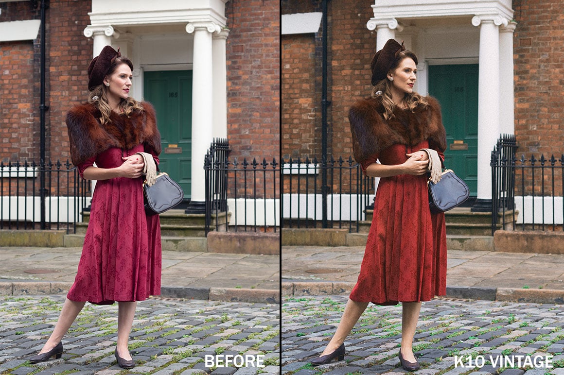
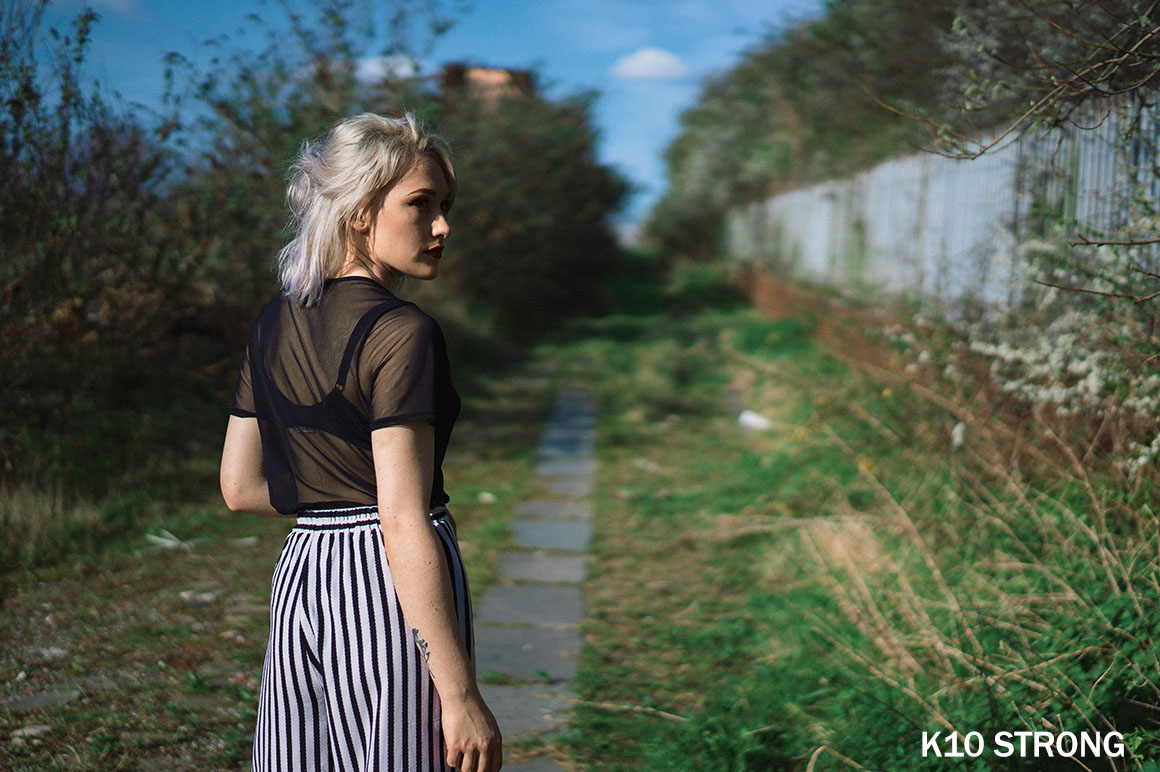
The granddaddy of colour films. 10ASA, with incredibly fine grain and sharpness. Used for everything from war propaganda to city snapshots, and with a beautiful, timeless tonality. my take on it is based mostly on high-res scans of 1940s images, which have a really distinctive look with warm orangey skintones, highly subdued greens, and often a crisp steely-blue cast to darker areas. I don’t really think I’ve ever seen an emulation of this emulsion but the presets work especially well for warming up vintagey street scenes and 30s/40s-styled photoshoots.
- Kodachrome 10 – typical 40s look, very warm orange tones and teal-hued greens
- Kodachrome 10 II – slightly darker and less saturated, with a little less warmth
- Kodachrome 10 III – less of a green cast, with more neutral midtones
K25 – Kodachrome II/25.
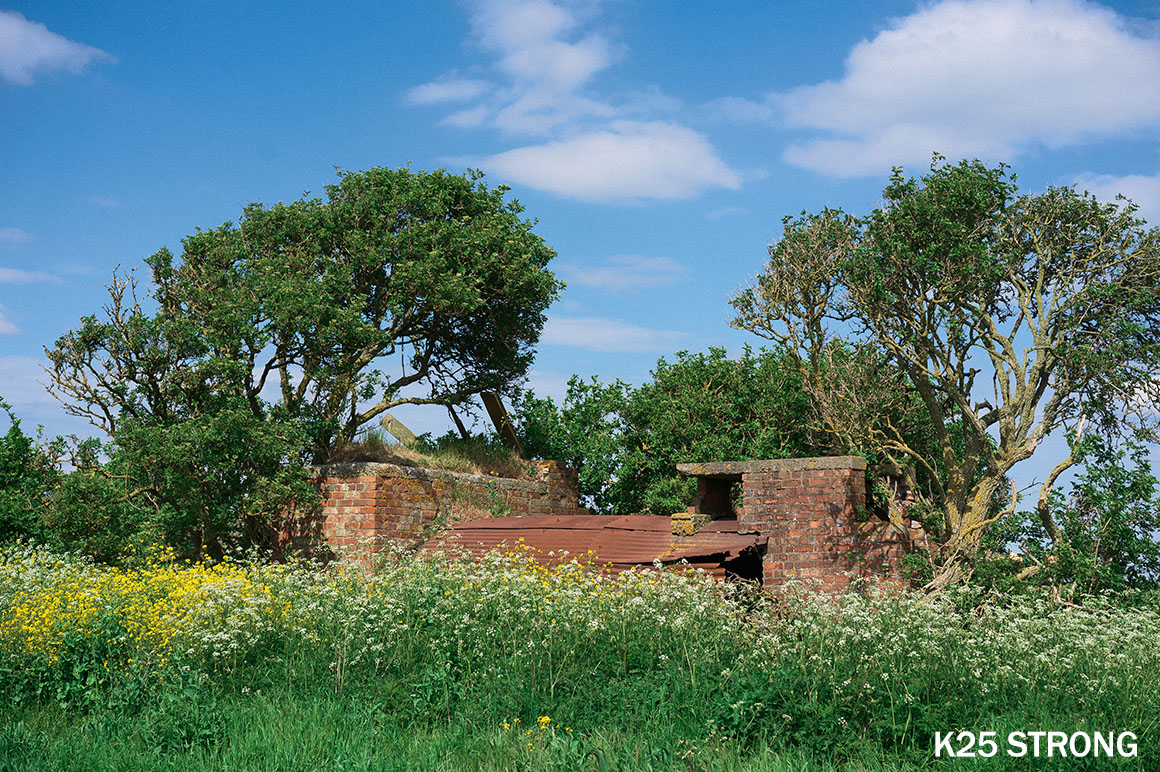
Released in 1961 as Kodachrome II , and in the mid-70s changed to Kodachrome 25 on the new K-14 process with new dyes and better sharpness, but we’ve bundled the two together here since they share a similar look. Timeless rich colours, insane detail, plenty of contrast – it’s an all-purpose film (though it shines most of all for outdoor scenes). I’ve found a lot of variety in how greens were represented with this film – sometimes foliage come out very warm and orangey, on other slides with a strong cyan colour like you see with a lot of negative films. I’ve tried to capture the full range of possibilities here:
- Kodachrome 25 – balanced and rich, warm orange tones and fairly bluey greens
- Kodachrome 25 II – cooler with more of a green cast, less saturated skintones
- Kodachrome 25 III – mid-way between the previous two, a little less pink
- Kodachrome 25 Subtle – midtones are close to neutral, and greens are less cyan
K64 – Kodachrome-X/64.
The younger, faster brother. Originally released as Kodachrome-X with a faster ASA64 speed, and updated in the 1970s as Kodachrome 64 with the new K-14 process. Often unfairly represented as having a strong magenta/pink cast, perhaps due to its unforgiving nature with exposure. Beloved of documentary and portrait photographers, it arguably offers slightly more flattering skin tones than the ASA25 versions.
- Kodachrome 64 – a little cooler and more pink than other styles, not too saturated
- Kodachrome 64 II – a touch warmer and with good neutral midtones, versatile
Presets
Each of the 3 film stocks comes with the following presets (except where mentioned), for a total of 27:
- ‘Natural’ – a good balanced starting point. Not too dramatic and designed to be all-purpose, but should still give you the nice fuzzy Kodachrome feeling. Similar to a well-corrected scan.
- ‘Strong’ – more of a defined look than the natural one. Expect stronger colour shifts, a little more contrast and perhaps a tiny bit of black fade.
- ‘Cool’ (K25 only) – just what it says on the tin. Similar to Strong but with cooler colours and more blue-green tones.
- ‘Warm’ (K25 only) – also what it says on the tin. Overall a little warmer with stronger red/orange tones.
- ‘Classic’ (K25 only) – basically ‘strong’ but a little bit faded, like a slide that was slightly underexposed or stored poorly.
- ‘Faded’ – don’t leave your treasured 35mm slides on a sunny windowsill, kids! Unless you want them to look like this. Nothing too extreme but you’ll see slightly crushed blacks with less shadow detail.
- ‘Vintage’ – stronger colour casts and crushed blacks, these aren’t based on any particular look but are more of a general representation of ‘When Slides Go Bad’. A bit more of a colour-gradey look for people who like things to look vintagey. Of course slides age in all sorts of weird ways, which is why we also have…
- ‘Vintage P/G’ – P for pink, G for green. They seem to be the most common colours with the faded-looking slides I’ve got. I’m not going to pretend these are some ultra-scientific emulation, they just look cool.
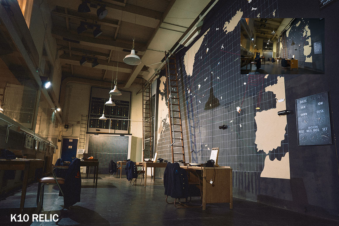
- ‘Relic’ – old and bold. A bit vintagey and faded looking but with lots of contrast and color shifts. I think of em as Vintage HD.
- Subtle – very gentle tweaks, for injecting a litle mojo into an image without changing it too radically. Feel free to adjust the profile opacity to taste.
- Relaxed – basically I was just running out of vaguely-descriptive words at this point… Somewhere between Natural and Strong. Perhaps the closest to reality in most cases.
PS: A quick thanks to my late grandad John Gerard – a veteran of the D-Day landings and keen amateur photographer – for leaving behind a wonderful archive of Kodachrome slides from the 50s, 60s and 70s. I’ve spent many hours poring over these, scanning them and in some cases revisiting the same locations he shot, and that’s influenced my personal idea of the ‘Kodachrome look’. I hope I’ve done it justice!
Additional information
| License | Personal, Commercial, Extended |
|---|
Only logged in customers who have purchased this product may leave a review.
Comments
There are no comments yet.
You must be logged in to post a comment.


Reviews
There are no reviews yet.