Digistock – Ektar 100 Advanced for Capture One
Digistock – Ektar 100 Advanced for Capture One
Probably the most advanced film styles ever made!
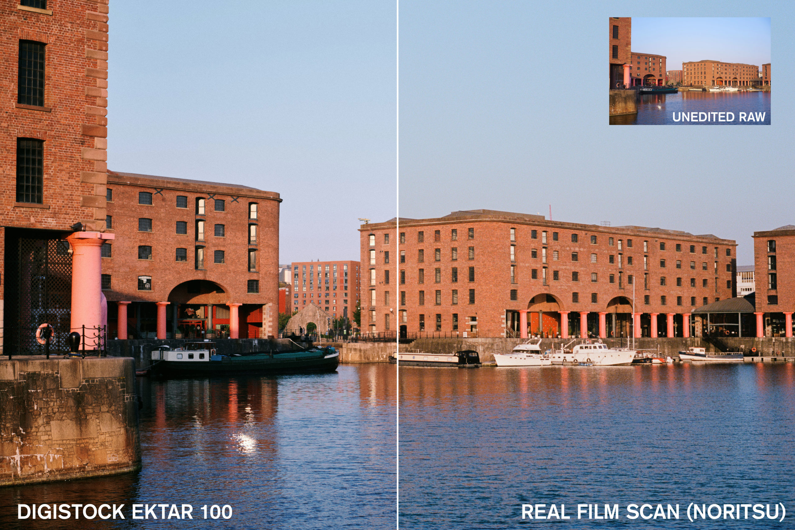
Don’t believe us? Click here to see a comparison with real 35mm scans…
Our most advanced pack yet! Beautiful hybrid styles developed by meticulously shooting, scanning and analysing the real film. Available for both Lightroom and Capture One, with almost exactly the same looks whichever version you choose.
We work hard to create the best film emulations possible for Capture One, and this is without doubt our most geeky and advanced yet. Which is why we called it ‘Advanced’, I suppose. For the first time in Capture One history, we’ve combined traditional adjustment-based presets with custom colour profiles to get the most accurate recreation of analog film possible; yet it’s still versatile enough to use more subtly as a general-purpose colour grading tool.
We’re proud to sell on Filtergrade and purchasers are eligible for the same discounts, free updates and customer service we offer to users buying from our site. Just email us with a screenshot of your Filtergrade order!
ABOUT THE FILM
Ektar 100 is one of the most modern and advanced film stocks on the market, introduced by Kodak in 2008. A product of the digital age, it’s optimised to be highly scannable, with incredibly fine grain and rich colour. Of course, as a colour negative film it still has a unique and distinctive look, noticeably different from results you’d get with any digital camera. Foliage takes on a crisp, bright look with a hint of cyan, blue skies increase in drama, and warm tones shift towards pink. Depending on shooting conditions and scanning, you’ll often get an overall cool look, sometimes with a magenta cast.
This vivid character is ideal for landscapes, snapshots, still life etc, though many photographers shy away from using it for portraits – sometimes the pink tones can give skin a garish look. However, with the right scanning settings it can be a wonderful film for photographing people too.
OUR EMULATION
Lightroom supports these natively, but getting them into Capture One is a lot less simple. Although it supports ICC profiles, these also have to handle the basic initial raw adjustments, which are different for every camera.
So we spent many long hours analysing the output of different cameras to find a suitable neutral ‘middle ground’ – a base profile which would give good results with any camera – to build our colour profiles upon. In the end we’re really happy with the results; each camera will have a slightly different look, but they’re no stronger than the differences you can get developing and scanning film. As far as we know, this is the first time anyone’s done film emulation in Capture One with this method, but we think the extra effort paid off.
One lovely bonus is that our Capture One and Lightroom styles duplicate each other almost perfectly, so users switching from one to another (or using both) can get matching results. Below we’ll explain a bit more about the technical stuff and – much more importantly – how you can use the results of our complicated nerdy work to make your pictures look good.
WHAT’S IN THE BOX?
Workflow
We try and find a balance between giving you lots of options, and not making things too cumbersome or fiddly to use. You’ll see a lot of folders when you first install the styles; don’t be alarmed! It’s like the giant mixing desks you see in recording studios; looks like an insanely complex sea of knobs and switches, but really it’s just the same few things repeated a bunch of times…
The five ‘strength’ folders contain our 15 advanced styles (profile-based), but progressively less strong in each folder. 100% are the ones which match the real film scans as closely as possible; then you’ve got 75%, 50%, 30% and 15% if you need something a little more subtle. They’re otherwise identical. Start with the 100% folder and if it’s too much of a big change for your tastes, try one of the others.
You’ve also got a sixth folder containing our 6 classic styles. These use only Capture One adjustments so you can add them to a layer, adjust opacity, change the settings etc. By nature this makes them less accurate as the profiles when it comes to perfectly matching the film, but that’s by no means a bad thing. They’re a little easier to use as creative looks and highly tweakable. Use both!
In the main folder we’ve included a bunch of extra tools and tweaks. They’re layer-compatible and work on top of any of the base styles. Don’t use em on their own though, that’s just silly.
It’s worth mentioning if there’s stuff you never use cluttering things up, just delete the styles/folders or move them into a subfolder – it won’t break anything.
Advanced Styles
Now we’re getting into the real meat-and-potatoes of the pack! Once you’ve picked your desired strength you’ll be greeted by these 16 lovely styles. You can read this to find out a bit more, or just click em – I mean, if it looks good, it is good.
A1) Ektar 100 – Natural
Based on well-corrected scans, with a nice neutral look. Rather subtle but you’ll see some little changes in greens and orange/reds, and cooler shadows.
If in doubt, use this one. Based on lightly-corrected Noritsu scans, you get that punchy, cool Ektar look with plenty of contrast and saturation. If highlights or skintones get a little too pink, there are tweak tools you may find useful.
If you take your film to a lab and they leave the scanner set to defaults, this might be the kind of result you can expect. Quite a cool/pink tone which works great for a lot of stuff.
The same base profile but with things jazzed up a bit. Some of the Noritsu scans came out looking a bit too flat and natural for the typical Ektar look, so more contrast and saturation was helpful.
This is based on some test scenes shot in a very sunny English garden around midday on a hot June day. I’m glad I did, because July has been remarkably horrible, cloudy and grey. English weather, folks! These have almost a Fuji look – greens are really cyan, and highlights have a magenta tint that reminds me of Pro 400H.
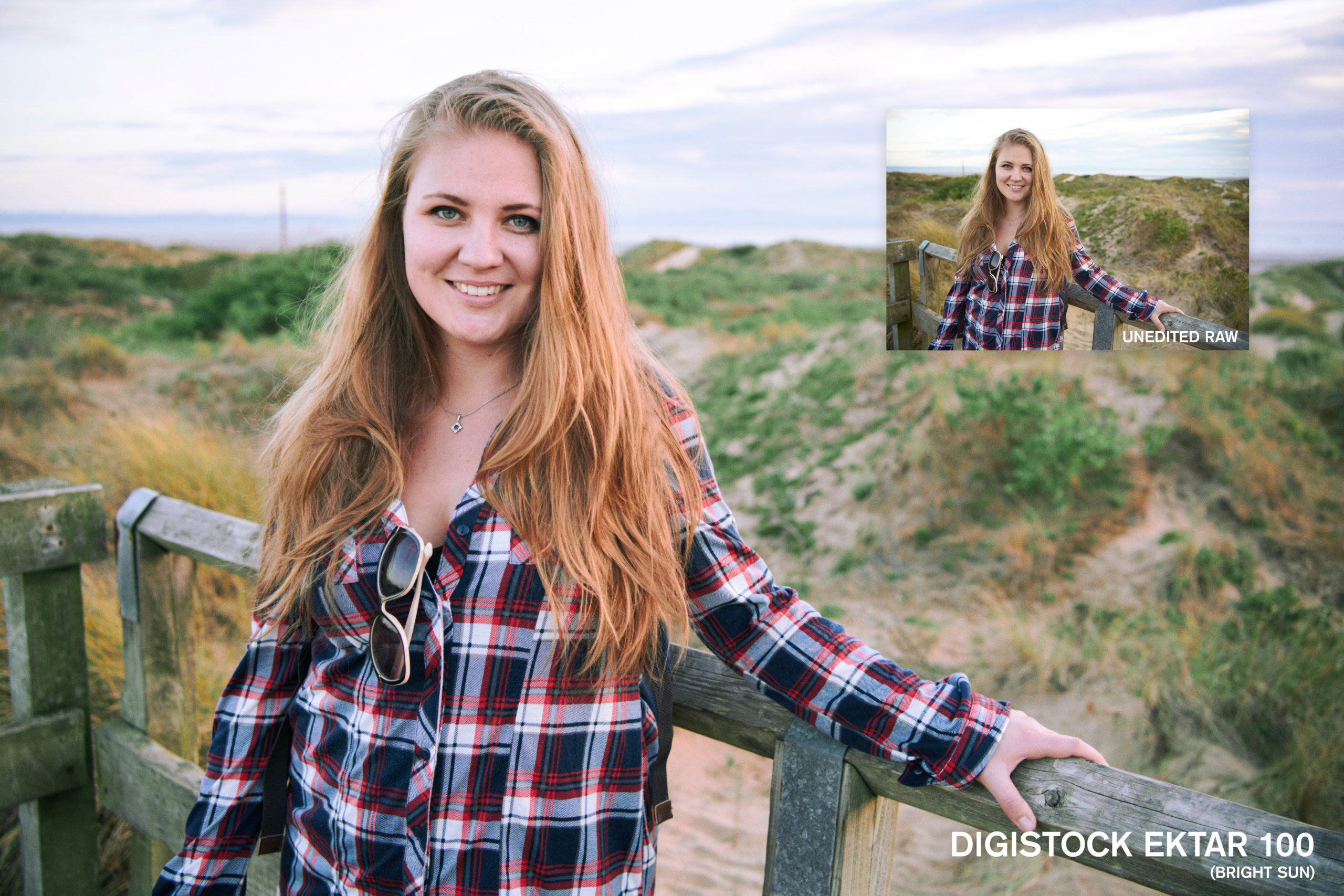
If you’re shooting in any kind of shade or overcast weather, give this a try. Your white balance will still dictate the overall balance of the shot (try around 5200K to get closest to the real film), but this will really alter the colour response. This works well for portraits too, I’ve found.
The underexposed test shots were made both in direct sunlight, and under studio lights. The colour profile mostly handles the colour shifts etc, while the curves to get the lifted shadows were done inside C1, so if you find the fading a bit too much just reset the curves tool.
The fading gets much stronger here but it’s based on the indoor scans, again reset the curves tool if you just want colours shifts etc. Looks more realistic with strong grain applied.
The fading might look pretty over-the-top like an Instagram filter but we promise it’s based on reality! Shadows turned to brown mush when we shot several stops under and brightened it in post.
‘Tungsten’ means the colour of old-school lightbulbs, and other artificial light. It’s much more orange than daylight, and Ektar is a daylight-balanced film so this orangeness becomes pretty obvious. We’ve modelled the colour and tonal shifts but not the orangeness – that’s what your white balance is for! Great for indoor and night shots.
If you’re shooting an ISO100 film at night or indoors, underexposure isn’t going to be much of a surprise. We noticed quite a big shift from the properly-exposed Tungsten shots; this might just our scanner being funny but we modelled it anyway.
Based on a different set of scans to B2, these exhibited more of a green tint in shadow areas and a generally colder look.
The murky brown shadows are pretty accurate to our scans, but once again don’t forget that you can disable the curves tool for a much less faded look.
There’s a fair bit of latitude with Ektar – a lot of the shots didn’t show a huge tonal difference when overexposed. We exposed for the shadows a lot anyway. But in some images there was an increased magenta tint and some nice shifting in blue skies.
Ektar isn’t a film that’s routinely pushed and pulled the way some stocks are – it’s already got a lot of contrast and the grain is incredibly fine at box speed, so there are fewer compelling reasons to. We decided we couldn’t justify shooting and scanning an entire roll pushed, so we got into the general ballpark based on different scans and sample images. You’ll get cool tones and strong contrast with plenty of saturation.
CLASSIC STYLES
These are your traditional Capture One styles – everything happens using C1’s own adjustments rather than relying on profiles. They follow a similar pattern to the advanced styles, based on the same scans, but are fully tweakable. You might like them so much you remove the hybrid advanced ones.
These are totally camera-agnostic since they apply on top of your existing camera profile, and are fully compatible with layers so you can dial in the opacity exactly where you want it. They’re great for colour grading and fine control.
Combine these as layers on top of the advanced styles for even stronger looks!
Somewhere between our Classic and Bright Sun profiles, this adds a lovely crisp coolness to photos. If the pink gets a little out of hand, try our tweak tool. Based on some lightly-balanced Noritsu scans.
Based on shots taken in deep shade, but it looks good with just about everything. Lovely rich blue tones, and strong reds tilt slightly towards violet. Rather lovely for portraits and fashion. One of our all-round favourites.
The fading on this is a little more stylised, matching the cool Ektar tones with warm lifted shadows. Very flattering and not too saturated.
More like an expired negative than simply underexposed, but it has a great retro look for lots of stylised color-grading fun. Great for vintage fashion.
Back to more realistic stuff, and like the profile version you’ll notice a real shift from orange to red in under Tungsten light. Not a huge difference from the Daylight styles in cooler images, the real differences are in the oranges and reds.
Pushed Ektar is just fun. Gobs of saturation and contrast, with that distinctive blue tonality that adds a clarity to just about everything. Try reducing the opacity if it’s a little too much.
TWEAKS AND TOOLS
GRAIN
An important part of realistic emulation is replicating the film grain and acutance (detail) of the film. However, doing both clean and dirty versions of every preset would’ve doubled the size of the pack and made it harder to use. So we simply separated these adjustments, after applying your film style simply click one of the 5 grain presets to add a realistic analog look to your images. 35mm has coarser and more noticeable grain than 120 due to the smaller size of the negative, and the stronger versions are modelled on the underexposed/faded shots.
For maximum realism, these grain presets also reduce the sharpness of the image to simulate the lower resolution of film – we find this helps the grain look like an intrinsic part of the image rather than an overlay, and gets you closer to the look of a film scan. If you find it too much, hit the ‘Reset Sharpness’ style or use the Subtle grain style. Remember you can easily remove an applied style in C1 simply by clicking it again.
FADING
We’ve also supplied a few styles which will add a faded look to your image. You can apply these directly or use them as a layer to adjust opacity. Have a play and see what works for you.
UTILITIES
Finally, a couple of utilities to help you fine-tune the styles the way you want them. Ektar can be rather unforgiving with skintones, especially paler caucasian skin, so we’ve included the Pink Skin Reduction tool to help with this. It’s very subtle and just takes the edge from skin which is a little too saturated (rosy cheeks, pink noses etc).
There’s also a simple Pink Highlight Reduction style which uses the Color Balance panel to counteract the magenta cast you sometimes get with Ektar (especially on the Noritsu scanner). Again it’s rather subtle but can be handy.
We’ve included quick contrast boosts too, if you find the default style isn’t pushing it quite hard enough for you. These manipulate the Contrast and Brightness sliders for a little boost; you’re probably quite capable of doing that yourself so feel free to delete them if they’re just wasting space.
Finally, there’s Cooling Blue Tones and Warming Orange Tones, quick grading shortcuts that slightly shift the tonality without touching the white balance.
Additional information
| License | Personal, Commercial, Extended |
|---|
Only logged in customers who have purchased this product may leave a review.
Comments
There are no comments yet.
You must be logged in to post a comment.


Reviews
There are no reviews yet.